10 Essential Elements of Website Homepages
A homepage is the digital front door of a website. It’s your opportunity to welcome your guests, make a good impression and convince them to stick around. A well-structured homepage helps users find what they need quickly and guides them to the desired action(s): letting them know who you are and what you do, navigating the site or clicking a call-to-action.
But if you’re not careful, your homepage could turn them away before they ever get the chance to do those things.
Here are 10 elements that are essential for effective homepage design and development.
1) Clear site identity and purpose
The homepage is usually the page of your website that internal stakeholders take the most interest in. Because of this, it’s common to see cluttered home pages that try to be all things to everybody, have no obvious purpose and forget about the needs of the users.
Your homepage has to tell users the purpose of your site; they shouldn’t have to click through to your about page to understand who you are, what you do and what you are offering. Nor are they likely to. If a user can’t understand within a couple of seconds what you or your business does, they will leave your website and go elsewhere. There’s always another competitor who will be happy to welcome your customer!
Craft a strong, snappy headline and sub-heading offering a brief description of what you do/offer. Avoid vague statements and be direct.
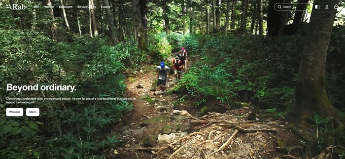
Rab is a great example of this, with a powerful user-centric slogan and descriptive sub-heading.
2) Shows users what they’re looking for
People visit websites with specific needs. Typically, these fall into five categories: to gather or research information, buy something, contact you, join your community or to be entertained.
The homepage needs to make it obvious how users can get what they want or where they need to go on your site to get it. You achieve this through a logical site structure and clearly visible and easy-to-understand calls to action.
If your website serves multiple audiences, consider segmenting your homepage content. For example, a charity site might direct users toward "Donate," "Volunteer," and "Learn More" sections.
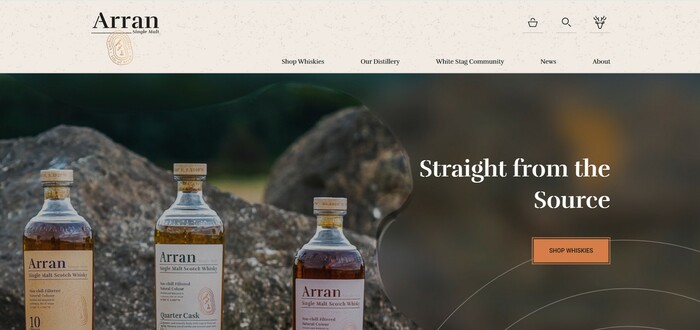
When we recently worked with Arran Whisky on a new website design, we made the whisky shop and products very much the focus of the homepage.
3) Primary calls to action
A homepage - much like any web page - should lead a visitor to take action, whether that be clicking to learn more, signing up for a newsletter, making a purchase or donating to a charitable cause. These should be easy to find and stand out visually. But you need to be strategic; overloading the reader with too many options will only confuse them.
Focus on a couple of primary actions to take users to the next logical step of the journey. So, for example, decide if a user downloading a resource is more important than them registering to receive your newsletter. If so, focus only on that and make it as valuable as possible.
The order in which users are likely to complete actions is also important, e.g. downloading a file before signing up for a newsletter, or making a one-off donation before becoming a regular donor.
The homepage for Charity: water has a powerful message, followed by a call to action for users to donate to their charitable cause.

4) Addresses users who aren't ready to commit
Not every visitor to a page is ready to take action right away. In fact, the average conversion rate for a landing page is less than 10%. But that doesn’t mean that 90% of visitors simply disappear, never to be seen again. They might just be gathering information, carrying out research or comparing one competitor to another.
Your homepage plays a key function because it’s a place that visitors are likely to navigate to, even if your inner pages are well optimised and full of information. Think about how you navigate a website. How often do you click on the logo or the home button to get a feel for a brand or to re-focus your search if you get lost on the site?
Whatever it is your business does, your homepage should make it easy for visitors to learn more, either through blogs, case studies, testimonials or FAQs. For example, more in-depth features of your product, helpful resources,or if you are a charity, what a donation goes towards. These elements keep users engaged and build trust, making them more likely to return when they are ready.
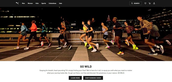
Despite PUMA’s trusted brand authority, they still understand the importance of this, ensuring products featured on their homepage include a link to learn more.
5) Communicates your USPs
Unique Selling Points (USPs) set your organisation apart. They explain why a consumer should choose your product or service over a competitor. Maybe you have the best product, the lowest price, free shipping and returns, ethical values or the first of its kind.
Your USPs should be easy to find and presented without exaggeration or fluff. It could include statistics about your impact, key differentiators from competitors, or a mission statement that resonates with your audience.
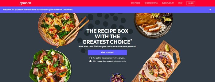
Gousto achieves this by highlighting their choice of options as a way of standing out in a very competitive market.
6) Uses social proof
People trust other people. If a visitor sees that others have engaged positively with your organisation, they are more likely to follow suit. Social proof is the positive influence created when a person finds out that someone else is doing the same thing.
When a user lands on your website, they’re unsure how good your offer really is. Your job is to convince them. You can sway them, using social proof. Testimonials, reviews and case studies shine a spotlight on what customers like about you or how they have benefited from your product or service. Including logos of partners or client organisations can also add credibility.
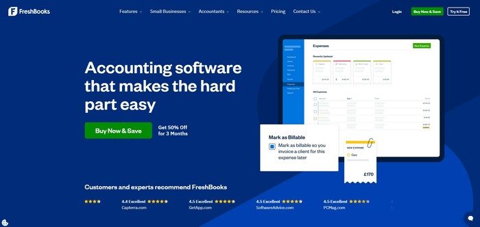
Freshbooks do this well by including ratings from trusted companies who have used their product.
7) Tells a story
A homepage should tell a story, rather than simply sections broken into unconnected, fragmented parts. Rather than dumping content on your homepage, your identity, mission and USPs should work together to weave an engaging story.
Storytelling makes your website more engaging and memorable. Instead of listing dry facts, highlight a success story, a personal testimony or a narrative about why your organisation exists.
Storytelling was vital in our work with Edinburgh Festival City.The story of why Edinburgh is the world’s leading festival city runs the homepage and the rest of the website. The powerful images also visually bring the story to life.

8) Is Memorable
There are over 1.2 billion websites in the world. That’s a lot of competition.
The best way to grab your visitor’s attention is to stand out from the crowd. Users will remember a homepage that is different, so think about creative ways to achieve this without losing sight of what's relevant for your brand and website usability. Strong branding, clear navigation, choosing the right typography, professional imagery and interactive elements can all help to achieve this.
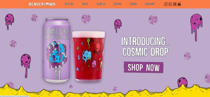
Beavertown Brewery balances its striking design with clear navigation and strong brand identity.
9) Uses visual assets
Images, videos and graphics make a homepage more engaging. They break up text, add visual interest, and help communicate messages (most people understand information quicker when it's visual rather than text).
Use high-quality visuals that align with your brand and avoid generic or stock imagery. Be mindful of accessibility by including alt text for images and ensuring videos have captions.
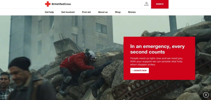
The British Red Cross adds visual context to their call to action for aid donations through a video that loops in the background of workers providing emergency assistance.
10) Responds to change
Websites need to evolve. Trends, technology, products, algorithms and user needs change over time, and a site that adapts remains relevant and useful.
A homepage should be flexible and updated in line with changes to your brand’s positioning and goals. Keep content fresh by regularly reviewing and updating text, images and calls to action. If your organisation runs campaigns or seasonal initiatives, update the page to reflect the changes.
But don’t just make a change for the sake of it. We recommend only doing so if you have evidence that the existing element is not working well. If so, it’s best to perform A/B testing to evaluate a specific change by measuring ranking position, traffic, click-through rates and conversions.
Conclusion
There is much more to consider when designing a homepage than simply how it looks. To effectively engage visitors requires careful consideration of your business goals, what your audience needs (and wants) and their user experience. By including these 10 elements, you create a stronger, more effective experience for every visitor.
If you would like help to make your homepage the best it can be, we would love to hear from you.